
Why a Mobile Mania Stand Alone Website may be right for you.
Although a Responsive Website offers your visitors a great experience regardless of the device and screen size, most mobile users are using smartphones. If you are willing to do a complete overhaul of your site, then responsive could be the answer. Let’s face it, some websites are rich in content and are best viewed on a desktop. But with Google preferring mobile-ready sites within their search results you will need to have a mobile presence to be found.
When less is more.
Our Mobile Mania program can give you a mobile-ready site without rebuilding your content. After all, most visitors want to know how to get in touch or see a map of your location. We take your current website and break down the content to a minimum – letting your visitor know just enough to click the Call Now button – the rest is up to you.
Contact us for a free evaluation and quote to make sure your web presence is mobile-ready.
Some facts to consider:
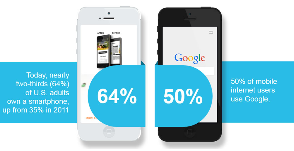
YOUR CUSTOMERS ARE ALREADY MOBILE
MOBILE MATTERS TO GOOGLE NOW MORE THAN EVER

SO HOW DO I BECOME MOBILE-FRIENDLY
Google outlines two ways to make your site mobile-friendly.

Both approaches will adhere to Google’s new guidelines, but there are a few differences.

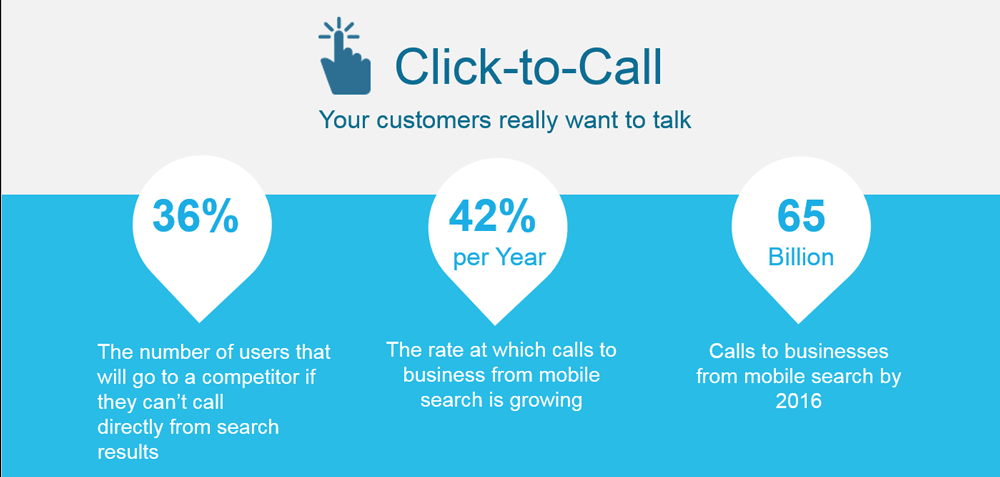
ANOTHER REASON MOBILE SITES WIN
Business-driving Features
The key to creating a great mobile website is the careful implementation of thumb-friendly Features.
These are what provide your customers with the small screen experience they require

THE DIFFERENCE ONE FEATURE MAKES

You must be logged in to post a comment.